February 22, 2009

Art Practice - Hand

(This post is doubled up from my GameDev journal)

For the next couple of weeks, I’m going to be doing a bit of self-directed study as a sort of crash course in creative arts, with a bit of programming thrown in. It’s a sort of wake-up call to shake the rust off my brain and get innovative again.

To start with, I’m doing a few learner exercises in pencil drawing. Eventually I’d like to focus on cartooning and vector art, but I never got around to nailing the basics. Every art book I’ve read tells me that you need to learn how to draw reality before you can abstract, so I’m starting with real-life drawing. However in deference to the fact that everything I do is digital, I’m mostly using ArtRage instead of pencil and paper. It’s a chance to learn computer art and tablet skills at the same time as the basics.

I’ll be posting a few scrapbook pieces here as a sort of public marker of my progress. To start, here’s an image of my hand, drawn with virtual pencil, chalk and paint roller. Admittedly the outline of my hand was effectively traced; tracing is dead easy to do on computer but I’m not sure if copying by eye is better practice.

Permalink • Print

January 22, 2009

Painter Essentials, GIMP, Inkscape

A very quick review of some other editors…


Name: Corel Painter Essentials 4
Company: Corel
Platforms: Windows, Mac
Brief Description: Consumer grade paint and photo editing program
Demo Restrictions: 60 day trial
Cost: A$100 in Australia (US$66), unsure elsewhere
Web Link: www.corel.com (link goes to product page)

Corel’s Painter series has renown as the industry leader in emulating natural media. The professional package Painter X has a professional price tag to match ($799), but the consumer priced option, Painter Essentials, is considerably cheaper. A boxed version can be bought from Apple Australia for just a hundred Aussie bucks, so that is within my budget for tools.

Painter Essentials 4 lies somewhere between ArtRage and a traditional digital editing suite. The prime feature is the natural art tools: brushes, pens, chalk and so on, but with a more traditional art software GUI and digital tools.

The GUI itself was not that hard to figure out. There’s a paint mixer panel on the right for blending paints to make colours, and the last used brushes are listed in a column on the left next to the tools. However, the icon used for the brush bugged me a little. Often the size of the brush drawn didn’t match the circle. When one brush showed nothing at all I realised the tablet wasn’t properly configured for Painter Essentials, but after calibration it still didn’t always match what I expected.

For sketching, the lines are smooth and follow the curves I make. The resulting pencil lines were too pixellated for my tastes. When compared to the default pencil in ArtRage or Sketchbook Pro, Painter Essentials is somewhat ugly.

The deal breaker with Corel Painter Essentials 4 was my quick demo was plagued with glitches. Sometimes a phantom brush icon would be left on the screen, and many times the extendable brush window would not be selectable or retractable. The experience just did not feel as seamless and polished as I expect for a commercial art program.

In fairness to Painter Essentials 4, this was a whirlwind review. But I just did not get a good vibe from using the pencil tools. I’ll give Corel a pass this time.


Name: GIMP 2.6 (The GNU Image Manipulation Program)
Organisation: The GIMP Team
Platforms: Linux, Windows, Mac
Brief Description: Open source image manipulation and raster editor
Demo Restrictions: Not Applicable
Cost: Free
Web Link: www.gimp.org

Ah, the GIMP. This is the most popular open source, free digital editor out there today; the Linux users replacement for Photoshop. Some might argue this, but at least you can’t beat the price. I’ve had GIMP 2.4 installed for a while, but this quick test was an excuse to upgrade to the latest version (2.6).

The interface is mostly that floating tool panel on the right in a separate window, coloured in what I like to think of as “Linux Medium Grey”. GIMP does its best to remind you that you are using a program designed for Linux. On the Mac, it is based on X and thus runs in X11, which means you won’t get the Mac standard of having the menu in the top bar. This isn’t actually that bad when you get used to it, but GIMP also goes out of its way to retain its own unique look and feel. In this sense it is somewhat like ArtRage which also uses its own style, but in the GIMPs sense it feels far more… well, I was going to write “utilitarian”, but that means “practical rather than attractive”. I’ll get to that next paragraph, so I’ll just say “Linux-y” instead.

The problem is the GIMP interface seems like there wasn’t much thought put into how it would actually be used as a tool. I don’t like the arrangement of the tools and the choice of icon shapes in the toolbox - I keep having to hover over each one to read the tooltip even though I’ve been using the GIMP for a while. And I don’t know why every single transformation type needed its own separate icon - rotate, scale, shear, perspective and flip. It’s also very annoying having the toolbox in a different window. It means every time I select a tool, I need to dab the stylus once on the image window to reselect it again before I can draw. This does not feel like a tool designed to work with graphics tablets.

The actual act of sketching with the pen is all right though; passable, but with a few niggling flaws. You still get the jaggies on circles if you go too fast (the circle on the lower left in the screenie above shows this to a degree). An annoyance is that the cursor used with the pen tool is just a typical mouse arrow with a pen icon offset against it, rather than a cross hair or some other more intuitive cursor. It’s definitely usable as a sketching tool, but there are better alternatives out there. (Edit: I’ve been informed in the comments that this is adjustable in the preferences. Thanks, Skip!)

To be fair to the GIMP, it does excel at what its name sake is. I prefer to use GIMP for image manipulation, such as cropping and resizing images to stick up on the web like the screenshots I do in this review. For that it works quite well, although the transformation tools are a bit of a pain in the arse to use. In all, GIMP feels and runs like a programmers art tool, made by programmers for programmers and the sorts of image manipulation programmers want to do. Unfortunately, that doesn’t translate to a natural art experience when you want to get in touch with your creative side.

To sum up, you might as well get the GIMP (it’s free!), but you’ll probably need other tools for your art needs.


Name: Inkscape 0.46
Organisation: www.inkscape.org
Platforms: Linux, Windows, Mac
Brief Description: Open source SVG editor (vector graphics editor)
Demo Restrictions: Not Applicable
Cost: Free
Web Link: www.inkscape.org

Anyone who has been reading my journal knows that I love Inkscape. It’s my favourite vector editor. Actually scratch that, favourite art software in general, even when compared with more costly alternatives. This might just be because it is a rare beast: a complicated open source application with an interface that does not suck. GIMP might try its hardest to remind you its from the world of Linux and the world of programmers who want to things there own way, but the Inkscape people decided they might as well emulate the interface from actual usable tools in their domain (FYI, the interface was modelled off Xara). Inkscape looks clean and professional as a result.

As a consequence and given that it is free, it is ideal for beginners to vector art to pick up and learn. That’s what I did, and it’s why I favour vector art to raster. Even when using something like Illustrator or Flash, I prefer to do the base work in Inkscape and port it across; although to be fair that might be because I haven’t put in as much time to master their interfaces. (Flash doesn’t seem too bad, but Illustrator seems to suffer from some moon logic with the node tool. But I’m digressing).

Inkscape can also be used as a sketch tool via its calligraphy option. You can get some nice smooth curves that can be used for scribbling. My current technique before doing anything complex with vectors is to scribble out some guidelines with the calligraphy tool, much like in the screenshot above.

Now that I am doing this as part of a test, I notice that drawing the curves feels a bit delayed. I don’t think this delay is real, but it is a consequence of Inkscape’s translation of the curves made into vector form. Inkscape will highlight the current section you are drawing, so as you draw it feels a bit unnatural. Once you release, it then sets the curve, so there’s a bit of a shift in appearance. You get used to it after a while, but it’s a bit disconcerting if you are looking closely at what you are doing and are expecting a more natural, pen like curve. The other issue is that sometimes if you go really fast, the curve will stop drawing.

Summary: Inkscape actually works fairly well as a vector based sketching program, but you might only want to use it as such if you are then going to build something in vectors using Inkscape. For general sketching, another tool is probably better. Note though that for vector art, you can’t go wrong with downloading and trying Inkscape - it’s free, after all. I also posit that for programmer art it is a better choice to pick vector over raster, as you will have a greater chance of making something pleasing to the eye. This is especially true if you don’t have a tablet - vectors work well with the mouse, raster in general does not.


My general conclusion is that ArtRage offers me the best bang for buck as a sketching program and as for digital art improvement. I’ve bought myself an license for ArtRage 2.5 Full, and I’ll see what I can do with it when practising the basics.

Note: I left out Adobe Photoshop from my comparison list. I actually have a license for Adobe Photoshop CS3 and need to learn to use it too. However I feel the interface for Photoshop is a bit overly daunting for learning the basics. It seems well suited for touch up work, but until I feel more like an artist I want to stick with something more simple.

Permalink • Print • 2 Comments

Autodesk Sketchbook Pro

Time for another quick art software review: Autodesk Sketchbook Pro.


Name: Autodesk Sketchbook Pro
Company: Autodesk
Platforms: Windows, Mac
Brief Description: Professional digital pen software with gesture based interface
Demo Restrictions: 15 day trial
Cost: US$100 download in North America and Japan, unknown elsewhere
Web Link: www.autodesk.com (link goes to product page)


Sketchbook Pro is a simple yet elegant drawing program. Originally made by Alias, creators of Maya, it is now owned by Autodesk, famous for its range of engineering grade modelling software. Like an engineering tool, Sketchbook Pro has a professional aura about it; it looks and feels like the tool an architect would use.

Sketchbook Pro has a very minimalist interface. All the key functionality can be accessed through the tool ring in the corner. Select an icon with the stylus, and a wheel of options can be selected through a gesture. It is elegant to use and lets you focus on drawing. I like how the tools can be moved to either the left or right corner; for left handers like me, its nice to have the tools in the more easily accessible bottom right corner.

The tools available are shown in the screenshot above, but it is deceptive. There is actually only [i]one[/i] drawing tool. The differences all come in the variable presets, of which the tools above are standard. You can define custom drawing tools if you wish, although they will only be accessible through a tool box, not the gesture friendly tool interface. Personally I find all the tools to look a bit same-y. There doesn’t seem to be much difference in feel between the pencil, ball point, chisel tip pen and paint brush.

Unlike ArtRage, Sketchbook Pro is a digital editor through and through, so you get cut, paste and lasso tools as well as moving, scaling and rotating the canvas, as well as layer support.

So, how does it stack up to sketching?


Doodling around with the pencil is actually surprisingly fun. The line algorithm is used in Sketchbook Pro was developed well. Lines feel smooth and crisp, and there isn’t the jerky bumpy quality you get with quick curves in other programs. The actual result might not look as much as natural pencil as with ArtRage, but it feels good to brainstorm ideas with.

Now for a more involved character sketching test…

Sigh. Now you know why I want to improve my art, as well as why I tend to stick to very blobby abstract cartoon designs in vector format. This is another character from the archive from years back. My drawings back then were terrible too, but better than this. Not a fault of Sketchbook Pro, though. This was very easy to sketch up. The ball point pen does not feel quite right as a line inking tool, especially when compared with the oil paint in ArtRage, but it does a decent enough job. The interface is painless to use for sketching.

Sketchbook Pro does not have much other utility than as just a sketching tool. It does not seem well suited for playing with colour in the same way the paint in ArtRage does. But for what it does, sketching lines, it does extremely well.

The main drawback for Sketchbook Pro is availability and price. For those of you in North America or Japan, you can buy a download version for US$100. This is more expensive than ArtRage and other tools more aimed towards hobbyists, but is not that expensive when compared to the full price of art tools like Corel Painter X or Adobe Paintshop Pro. Given that Sketchbook Pro is just a sketching tool, nothing more, you will need to weigh up whether this functionality is worth the price. If you are serious about sketching, then Sketchbook Pro may be for you.

Unfortunately, Autodesk’s online store does not sell to Australians for some unknown reason. For those not in the U.S., Canada or Japan, you need to buy Sketchbook Pro through a local reseller. In Australia, all the local Autodesk resellers aim for the business market, and as such have very spartan websites that do not mention the price of their products; most do not mention Sketchbook Pro at all. My hunch is that Australian business will be selling Sketchbook Pro at the original price - US$179 - plus the usual Aussie import mark up fee, plus business expenses. Given that Autodesk wants me to jump through hoops just to give them money for what is essentially just a unlock code for the demo I already have, I feel extremely disinclined to send them my business. Rule one of business: never make it hard for willing customers to give you money for your product.

In review, Sketchbook Pro is in my opinion a smidgen better than ArtRage when it comes to sketching ideas. If you do a lot of sketching, this may be worth the extra money to get the product. For me, it is not worth the extra effort to figure out how to get Autodesk to sell it to me.

Next up, I will try Corel Painter Essentials. Then perhaps a quick recap of GIMP and Inkscape when it comes to sketching.

Permalink • Print

January 20, 2009

ArtRage Starter Edition 2.5

Time for a sketch software trial. I’ll try to do one of these every day or two this week, weather permitting (my air conditioning is rubbish and it’s summer at the moment.)

I am trialling these on an iMac (20 inch screen, 2.4 GHz Intel Core 2 Duo, 4 GB RAM) running Mac OS X Leopard (10.5.6). While I am using a Mac, everything should have a Windows equivalent that I am assuming is similar.

My input device will be a Wacom Intuos3 6×8 inch (A5) tablet that I picked up a year or two ago but have not yet used to its full potential. It is a great piece of hardware; I picked mine up with an educational discount at the cost of some bundled software.

For those of you without a graphics tablet, I highly recommend getting one. A Wacom Bamboo is only US$79. If you do any form of drawing activities at all - which should include nearly everyone who works on games - then it is invaluable.

Today’s review is for ArtRage 2.5 - Starter Edition. First, the skinny on the software:


Name: ArtRage Starter Edition 2.5
Company: Ambient Design
Platforms: Windows, Mac
Brief Description: Natural paint media software with a minimalistic GUI
Demo Restrictions: Special: this is the demo for ArtRage Full Edition
Cost: US$25
Web Link: artrage.com


ArtRage is a digital painting program, with an emphasis on “paint”. It simulates natural media: oil paint, chalk, pencil and crayon on canvas or paper. It combines this with a very minimalist interface in order to help the artist focus on creating rather than micromanaging tools.

The demo version, ArtRage Starter Edition, is actually a full program in its own right - no time limits, no crippling of save functionality. Many of the tools and functionality of the full edition are greyed out, but you can make art with just the Starter Edition alone if you want to properly trial the software out, or happen to be really skint.

ArtRage does not have a massive number of tools and brushes, but the tools it does have look quite nice. The Starter Edition tools are oil paint, pencil, felt pen, palette knife (for smearing paint around), chalk, crayon, eraser and the colour picker. Also included is an adjustable ruler, an example of a stencil: more stencils are available in the full version. You can also adjust the type of material that you are working on. Rough surfaces give a different texture to smooth ones.

It is important to note what ArtRage doesn’t have. ArtRage’s focus is on simulating real media, real art tools on real surfaces, rather than as a typical digital editing tool. As such, ArtRage does not have some of the basic features that most digital editing tools have, such as cut and paste (although it does have undo and redo for mistake prone beginners like me). The Starter Edition does not have layers; you will need to buy the full version for layer support. So if you are used to digital tool techniques such as selecting regions, cutting, pasting and transforming these regions to make your art, you’re out of luck with ArtRage. This isn’t that kind of tool.

That being said, one extremely handy feature ArtRage does have is that ability to rotate the entire canvas, just like you might do with a piece of paper to get the best angle when drawing curves on it.

Still, I am not looking for an all-purpose digital art editing tool; I’m looking for good software for digital sketching and concept art. How does ArtRage fare for my purposes?

First brainstorming through sketches. Well, ahem, yeah. I’m not much of an artist and I couldn’t think of anything in particular to brainstorm here. So it’s a simple cartoon guy and some shapes. For this test I didn’t put much care into perfect lines and curves; I just went at it. This is generally what I do when I’m just doodling around for ideas.

The drawing process feels quite natural. I didn’t feel like I was fighting against the interface. It’s extremely easy to move and rotate the canvas around with just the tablet. Overall, ArtRage feels very nice to sketch things with.

The pencil tool itself is generally okay. I may not have chosen the right settings, but it does not look quite like it would if I were to sketch with a real wooden pencil on an A4 sheet. But it is serviceable and it does have an “arty” look that I like. It is plausible that with more ArtRage practice I will hit the right settings for the look I want. I can also try the felt pen and paint tools instead if I want a crisper line.

Of note is the difference between the circles in the bottom right corner. The “fast” circle was drawn quickly from my wrist. You can see that the resulting circle is somewhat bumpy, which I assume is from the sampling rate from my Wacom. You can see the same bumpiness in the sphere on the left which was drawn the same way. The “smooth” circle was drawn slower using my shoulder and elbow and is smoother. This may be an issue if you draw curves really fast.

For a concept art sketch and given that my creativity in brainstorming seems shot today, I raided my archives of game project ideas for some character ideas to recreate. Above is one of them, roughly sketched out in blue pencil then with lines filled in with black oil paint. Note to self: must practice perspective, hands and feet.

Again, this was not that difficult to do. I never felt like I was fighting against the interface. Probably the only issue was switching between blue pencil and black paint - I’d have to choose the colours manually. The full version does have a colour palette option, so that might work better. Also in the full version I could do both the rough sketch and the paint on different layers rather than the same one as done here.

Overall, I think ArtRage handles my needs as a sketching program quite well. Certainly better than the other tools I’ve been currently using.

For additional features, what ArtRage does well is paint. You can smear paint around your canvas, and it interacts the way you would expect paint to interact. This leads to some interesting effects if you are a skilled painter, and results like a kindergarten finger-painting class if, like me, you are not. I would like to experiment more with the use of colour and the paint effects look like they could have some good uses, so this is a feature that is a big plus to me.

Furthermore, the great thing about ArtRage is the full version only costs US$25. This is very cheap as far as art tools go. At this price, I don’t think I can go wrong just buying the full version and seeing what it does.

In all, ArtRage is solid enough for it to be strongly in the running as my sketching program of choice. Due to its low price, buying the Full Version is an easy decision, and even if I do not use it as my primary sketching program it will not be money wasted.


Next test: Sketchbook Pro.

Permalink • Print

January 13, 2009

Sketching Software Trial - Introduction

This post is in stereo, posted both at my personal journal at trazoi.net and at my GameDev.net journal.

One of the things I plan to do in early 2009 is to brush up on my skills, as well as learn some new ones, in some dedicated practice sessions. My goal is to become skilled in all areas of game development and management. This is for a number of benefits: if I really have to I can make a game by myself; I can attract freelancers’ interest better with higher quality working prototypes; and I hope to find good synergy and innovations between the combinations of all the different fields.

A big area I need to work on is my art skills. I did some somewhat undirected doodling and scribbling throughout the last few years and brought my skill up to “poor”. After a lapse of the better part of a year, my art skill has deteriorated down to “very poor” or possibly “terrible”. It needs some serious work, and that means serious practice.

I think this time I will try more digital art practice than before. I used to just doodle around on paper with pencil, but things hardly ever got finished that way. I have never been very good with ink due to my somewhat bad left handed pencil grip; everything smudges so easily. With digital it is easy to correct mistakes, plus I get more practice with my Wacom tablet and actually getting images into the computer.

At the moment I am only reasonable at using Inkscape, the free open source SVG editor. However a vector editor like Inkscape may not be the best tool for this job. Therefore I am looking for another good tool for a relative art beginner to learn with. I am currently reviewing a few that I have heard are good for this.

A brief checklist of the properties I am looking for:

  • Good as an equivalent for freeform rough pencil sketching, brainstorming ideas and building up interesting characters. Typically I do this with a pencil on A4 paper when trying to figure out what works and what doesn’t. For a software tool to emulate this, the interface should stay out the way and make it easy for the ideas to flow.

  • Good for sketching the basic skeleton of an image. When I draw a typical Inkscape image, I usually start by doing a rough sketch as a basis. Currently I do that within Inkscape itself using the calligraphy tool, but importing raster images works too. A high quality finished result is not necessary for this stage, but it needs to be good to use as a reference image or as an underlay.

Highly desirable additional properties are:

  • Ability to ink the rough pencil sketch into a final version. The more I can get done in one tool the better.

  • Ability to extend further to make full pieces of concept art. Not essential, but would be extremely useful if I get good at a particular tool.
  • Any other features that I think would help in learning art - shading, colouring, use of different styles, ex cetera. This is not mandatory, but every extra useful feature for this helps.
  • And obviously, price is a factor too. I am more likely to buy useful software if it is cheap.

In short, I am looking for something that offers a fun, easy to use interface for rough pencil sketching and hopefully inking and other art features as well. A zillion extra professional features is not required.

Over the next week, during the periods I can stand my un-air-conditioned office space during the current hot spell, I will trial some software to see how it meets this criteria. My art skills are a bit shot, so I’ll do a few quick doodles to see how it feels then try a cartoon figure. I’ll spend maybe a few hours on each tool, then post a review up here with my comments. Once I’m done, I’ll buy whatever I think makes the grade.


My list of software to trial has expanded a bit since I posted a query in the art forum:

  • ArtRage 2.5 - emulates natural media, especially oil paint but also has pencils and markers. Comes in a free Starter edition with less features, and a cheap US$25 Full version.

  • Autodesk Sketchbook Pro - designed to be a digital sketch pad. Is very popular with artists for the role I am looking for. US$100 for North Americans, unknown price for me.
  • Corel Painter Essentials 4 - Painter X is the leading product in natural media software. Essentials is the toned down version for a fraction of the cost. Essentials costs US$100 from Corel, although Apple Australia is offering it for A$100. (Painter X is about seven times the price).
  • Adobe Photoshop CS3 - The big brand name art tool. CS4 is the current version, but I already own Creative Suite 3 (I got it to get Flash plus all the other Adobe tools with an educational discount). Costs about as much as Painter X, but you can get the stripped down Elements for less. For me, cost is moot as I already own it.
  • GIMP 2.6 - The open source raster art editor. I have had misgiving about GIMP, but for fairness and completeness I will add this into the trial. Cost: free!
  • Inkscape 0.46 - Last but not least, my favourite vector editor, Inkscape. I currently do sketches with Inkscape’s calligraphy tool. I am putting this in last just for comparison, plus I can compare a vector editor to all these raster editors. Cost: free!

That’s probably enough for a series of handy tests, unless I find out about another good tool out there. I’ll post each individual review here when I am done with the test.

Permalink • Print

April 15, 2008

Cartooning practice and Inkscape 0.46

School’s out for a fortnight here at uni. Which as a PhD student who is tutoring means I get two weeks of unfettered PhD write-up time. I’m pretty worn out from the teaching and marking over the last couple of days, although it just might be lack of sleep catching up with me.

I’ve also noticed a few more trackings from Inkscape fans to the tutorial I made for Order of the Stick avatars. I’m guessing people need Inkscape tutorials. Once my PhD write-up is over I’ll write up some more (general purpose this time).

I need some practice with the new version however. And practice in general. I’m not that much of an artist really, and my cartooning really needs some brushing up.

I’ve started playing around with Inkscape 0.46 by just giving it a spin in creating a character using my old techniques:

  1. Sketch out a draft with pencil on paper.

  2. Resketch it using the calligraphy tool in Inkscape on a draft layer
  3. Construct the figure out of basic shapes and curves (this is the long part)
  4. Put in any special effects, shading, corrections and what-have-you.

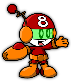
Eight

This is a pretty early concept for the character “Eight” that part of one of two ideas for a webcomic that I’d like to launch later this year. I still haven’t made up my mind about the little details like colouration and accessories.

So far the process for creating this character isn’t working - not because of the final output, but because it take so freakin’ long to do. I don’t know if it’s because I’m out of practice in the whole Inkscaping, but it could just be I don’t have an efficient process. To test this, I’ll give making this character another go, but this time using a more traditional inking based approach - both digitially and on paper. I’m rubbish at paper inking and almost as rubbish at digital inking, but it’s something I should at least try to see how it turns out.

Permalink • Print • 4 Comments

March 28, 2008

New links

It’s the end of the week, and my voice is shot from taking tutorials and labs for the last three days. I’ve been living a life of a quiet research student for years, so my vocal chords aren’t up to the extra stress of hours of explaining things to students. I’m looking forward to a somewhat quiet weekend of typing.

I’ve been somewhat neglecting this site as of late (way too busy, sorry), and I’ve noticed that I’ve been getting traffic from some Inkscape sites for the tutorial I wrote for Order of the Stick avatars. I mainly wrote that for the Order of the Stick forums - I noticed they had a lot of people using Inkscape but were in need of a good tutorial, and the style of that art works really well as a tutorial. But I didn’t expect it to get any attention from elsewhere. It’s good to know that it’s of extended benefit to the community at large. I’m hoping to write more tutorials once I get enough time to do so (it takes far longer than you think to write one of those things!). If you’ve stumbled on my blog from one of those sites, welcome! And I hope you enjoy the tutorial!

I’m also hoping to clean this site up a bit some day soon - it needs a new face lift and a new poll. Unfortunately I’ve got a huge amount of stuff to do right now, so I can never guarantee I’ll actually get to do something until after I submit. I’m looking forward to having less deadline pressure and more time to devote to projects like these - I’m sure I’m due a week or four off after I submit.

Permalink • Print

February 20, 2008

Playing with Palettes

I’ve been leaving this journal idle for a bit too long. Even though I’m spending most of my time writing up my dissertation, I do spend some time doing other things. Lately I’ve been looking at the use of colour with an eye as to how I can apply it to my artwork.

I’ve never been that brilliant in the use of colour, so I thought it was something to look at as I play around with drawing comics in Inkscape. My feeling is that it would be wise to deliberately limit myself to a palette, so I don’t have to choose from a theoretically infinitely fine colour space. Plus it can help aid the classic palette look that was prevalent in games prior to SVGA.

Choosing a good palette is tricky. I haven’t seen that much on the internet on methods of choosing the best palette for your style of work. To start with, it depends a bit on what colour model you are using: RGB, CMYK or HSL. RGB is the most common used in computer graphics, as it directly maps to the colours used to generate the pixels on your screen. CMYK is used by printers, and is traditionally used by comic artists. Finally, HSL (and its cousin HSV) is nicely based on hue, which is important in ensuring you have a good set of colours that match.

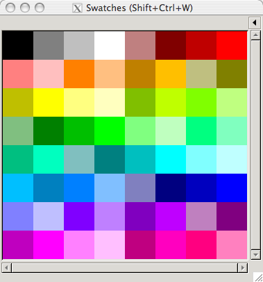
To start with, I looked a bit at the old comic book formats. Those were limited in their palettes for technical cost saving methods; they only had screens for inking for 25%, 50% and 100% for their coloured cyan, magenta and yellow inks. This gives you a very limited palette, which I’ve mirrored with a version in Inkscape as shown here:

Comic Style Palette

However, I’m not limited to using inks. So I made a simple Python script to help me play around with different palette choices (and learn a bit more Python as well). I threw together a simple script that can output a GIMP format palette, which is also the format used by Inkscape. Here’s a copy of the script if you’re interested: it’s a bit scrappy as I threw it together as I was thinking of ideas, but it’s got some useful things in there, such as RGB to HSL conversion (and vice versa).

The current model I’m leaning towards is one based in HSL, centered around the twelve basic hues. These are the hues you get if you go around the colour wheel by thirty degrees: you’ll hit all the primary, secondary and tertiary hues on your way around. I’ve started referring them in shorthand form by single letter symbols:


Symbol Name Hue
R Red
O Orange 30˚
Y Yellow 60˚
L Chartreuse (Lime) 90˚
G Green 120˚
S Spring Green 150˚
C Cyan 180˚
A Azure 210˚
B Blue 240˚
V Violet 270˚
M Magenta 300˚
P Rose (Pink) 330˚

Most of those hues have their official name, although I had to take a few liberties with the ones that had a clash of initial. “Rose” had to take P for pink, which isn’t that much of stretch. Unfortunately I couldn’t think of a letter I was that happy with for “Chartreuse”, so I thought I might as well call it Lime. Lime is technically either halfway between Chartreuse and Yellow, or if you’re a web specialist it’s actually full green (why I’m just not sure). But if Crayola can call a tangerine crayon “Chartreuse” then I think calling chartreuse lime is a reasonable stretch.

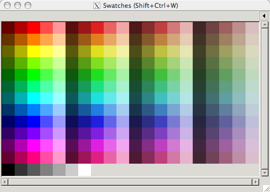
The current palettes I’m looking at have the twelve hues with varying levels of saturation and light:

Full Palette

I’ve also been working on a shorthand code for each of those variations as well. A full hue will just get its letter, but variations in light will get a range of numbers from 1 - 9 either before or after the letter (for darker and lighter respectively). Saturation levels are indicated by lowercase letters at the end, from a to s. Shades of grey are given the letter code “N” (for neutral hue) with numbers for lightness shades, and white and black are labeled “W” and “K” (for key, like in CMYK) It’s a bit subjective as a scheme, but which ones aren’t?

What I’m not sure about is which grades of light and shade I should put into my basic palette. I’m leaning towards having five grades of light and four grades of saturation, as well as the grey shades, as that is approximately 256 colours (a nice round number that works well with palettes). But I’m wondering if that’s a bit too much. I guess I need to use the palette more to find out.

Permalink • Print

November 2, 2007

Stupid Internet Memes Ruining My Creativity

As the comments to my last post have shown, I have been less than successful in weaning myself off the more useless parts of the Internet. It’s hard to muster the willpower when you have a computer on most of the time. But I’ll give it another shot over the weekend, where I can justify not having frequenct email contact to the rest of the world.

I’ve been spending most of my spare time trying to brainstorm ideas for a webcomic, but I’ve been in a creative drought (not a good starting sign). I’ve been trawling through my memories of my life experience to look for good concepts, but that’s been pretty depressing. My memories seem to split into the categories of the mundane or the unbelievable. Mundane would be much of my recent life; most of the day on a computer, working on hobbies at home, sometimes hanging out with friends; normal, everyday life stuff.

The unbelievable ones are even more depressing, because it’s hard to tie them all together. Plus many of them have been done so often they are now cliches, which is totally unfair. There’s a couple of years of my life which needs surpisingly little embellishment to turn into the story of how between working for a dysfunctional game company I helped a ninja, a Japanese exchange student and an eccentric tech-head who lived in his own hi-tech fortress to build a team of cute robots to take on the world - but it no longer seems that original. Stupid internet memes!

I think I’ll put this aside for a little bit; I really want to start a webcomic this year, but it’s hard to make the creative juices flow when you think too hard about it. I also really need to get back into Flash, so I’ll try to whip up that shooter game I was working on before my laptop needed repairs and limit myself to the weekend to complete it. Canberra has effectively a three day weekend with Tuesday off (and I don’t think many people will be working that hard on Monday), so I can feel a bit more relaxed.

Permalink • Print • 2 Comments

September 10, 2007

If Music Be the Food of Procrastination…

In which I use the Internet and GarageBand as half-hearted excuses on my slow progress in learning Adobe products

I bought a new toy yesterday - an M-Audio KeyStation 49e, a USB MIDI keyboard (the kind you play music on, not the kind you type with). I already have a more fully featured 76 key Casio WK-3000 keyboard which I love, but I never got around to getting the MIDI interface to hook it up to a computer. While I’ve been considering getting such an interface for a while, I decided it was probably better to get a smaller keyboard that can fit on a desk and can easily be carted around, hence the KeyStation 49e. It doesn’t have much range and the keys aren’t weighted, but I was after a small size and am used to synth style keyboards anyway.

My recent desire to play around with music stemmed from procrastination in learning Illustrator and Flash - what I was meant to be doing in my spare time last week. While I have been slowly teaching myself the basic tools, distractions were legion and my resolve was weak.

More on If Music Be the Food of Procrastination…

Permalink • Print • 3 Comments
Made with WordPress and a search engine optimized WordPress theme • Trazoi Bounce Box skin by David Shaw