February 20, 2008
Playing with Palettes
I’ve been leaving this journal idle for a bit too long. Even though I’m spending most of my time writing up my dissertation, I do spend some time doing other things. Lately I’ve been looking at the use of colour with an eye as to how I can apply it to my artwork.
I’ve never been that brilliant in the use of colour, so I thought it was something to look at as I play around with drawing comics in Inkscape. My feeling is that it would be wise to deliberately limit myself to a palette, so I don’t have to choose from a theoretically infinitely fine colour space. Plus it can help aid the classic palette look that was prevalent in games prior to SVGA.
Choosing a good palette is tricky. I haven’t seen that much on the internet on methods of choosing the best palette for your style of work. To start with, it depends a bit on what colour model you are using: RGB, CMYK or HSL. RGB is the most common used in computer graphics, as it directly maps to the colours used to generate the pixels on your screen. CMYK is used by printers, and is traditionally used by comic artists. Finally, HSL (and its cousin HSV) is nicely based on hue, which is important in ensuring you have a good set of colours that match.
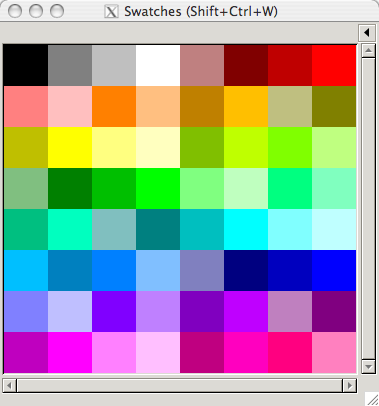
To start with, I looked a bit at the old comic book formats. Those were limited in their palettes for technical cost saving methods; they only had screens for inking for 25%, 50% and 100% for their coloured cyan, magenta and yellow inks. This gives you a very limited palette, which I’ve mirrored with a version in Inkscape as shown here:
However, I’m not limited to using inks. So I made a simple Python script to help me play around with different palette choices (and learn a bit more Python as well). I threw together a simple script that can output a GIMP format palette, which is also the format used by Inkscape. Here’s a copy of the script if you’re interested: it’s a bit scrappy as I threw it together as I was thinking of ideas, but it’s got some useful things in there, such as RGB to HSL conversion (and vice versa).
The current model I’m leaning towards is one based in HSL, centered around the twelve basic hues. These are the hues you get if you go around the colour wheel by thirty degrees: you’ll hit all the primary, secondary and tertiary hues on your way around. I’ve started referring them in shorthand form by single letter symbols:
| Symbol | Name | Hue |
|---|---|---|
| R | Red | 0˚ |
| O | Orange | 30˚ |
| Y | Yellow | 60˚ |
| L | Chartreuse (Lime) | 90˚ |
| G | Green | 120˚ |
| S | Spring Green | 150˚ |
| C | Cyan | 180˚ |
| A | Azure | 210˚ |
| B | Blue | 240˚ |
| V | Violet | 270˚ |
| M | Magenta | 300˚ |
| P | Rose (Pink) | 330˚ |
Most of those hues have their official name, although I had to take a few liberties with the ones that had a clash of initial. “Rose” had to take P for pink, which isn’t that much of stretch. Unfortunately I couldn’t think of a letter I was that happy with for “Chartreuse”, so I thought I might as well call it Lime. Lime is technically either halfway between Chartreuse and Yellow, or if you’re a web specialist it’s actually full green (why I’m just not sure). But if Crayola can call a tangerine crayon “Chartreuse” then I think calling chartreuse lime is a reasonable stretch.
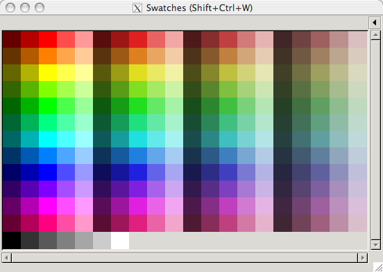
The current palettes I’m looking at have the twelve hues with varying levels of saturation and light:
I’ve also been working on a shorthand code for each of those variations as well. A full hue will just get its letter, but variations in light will get a range of numbers from 1 - 9 either before or after the letter (for darker and lighter respectively). Saturation levels are indicated by lowercase letters at the end, from a to s. Shades of grey are given the letter code “N” (for neutral hue) with numbers for lightness shades, and white and black are labeled “W” and “K” (for key, like in CMYK) It’s a bit subjective as a scheme, but which ones aren’t?
What I’m not sure about is which grades of light and shade I should put into my basic palette. I’m leaning towards having five grades of light and four grades of saturation, as well as the grey shades, as that is approximately 256 colours (a nice round number that works well with palettes). But I’m wondering if that’s a bit too much. I guess I need to use the palette more to find out.